" height="1913.5619468363557px" id="NtSzvO2Se" width="4480.43442910271px"/></svg>)
Transforming Tradie Payments
/25

The Challenge
The original version of Witzer was technically functional as a business idea and process, but it was visually chaotic, overloaded with duplicate interactions, dense layouts, and a steep learning curve for tradies unfamiliar with digital platforms.
Across three iterations, the key challenges were:
Users struggled to understand what had been paid, claimed, or approved
Brand colours (originally 5+) were initially used to separate the various areas of the app, but long term this would always lead to visual clutter
Builders and homeowners needed shared clarity — without added admin
Onboarding was confusing, especially for those not used to fintech products
The Goal
Redesign the Witzer platform across phases to improve:
Payment visibility and trust between parties
UX simplicity for builders managing multiple jobs
Visual coherence across the brand and product
Innovative features that reduce customer service strain and put Witzer on the map
And do it all without alienating a user base that’s often not digitally native.

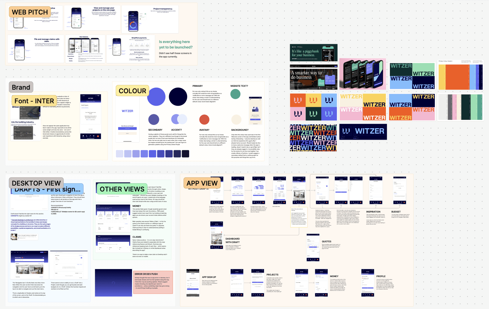
Process
I approached Witzer’s evolution in three phases — each shaped by time constraints, user needs, and internal resourcing.
V1: Audit & Annotated MVP (Legacy App)
Legacy UI relied on dense tables, unclear buttons, and zero visual hierarchy
Payment status was buried under jargon (“claims”, “milestones”, etc.)
Used annotations to expose UX flaws and content ambiguity
V2: 2-Week Redesign Sprint with Full Colour Palette
Brief: Refresh the UI in 2 weeks using the full brand palette
Outcome: Delivered a vibrant but overly saturated UI that improved layout clarity but created visual noise
Wins:
Created modular layout structure for job/project breakdowns
Established consistent icons, spacing, and payment flows
Improved readability and UX hierarchy for key workflows
Trade-off: Too many colours reduced trust and brand recognition
V3: Strategic Pivot, Brand Refinement & AI
Brief: Redesign Witzer with a tighter, more confident UX — and explore how we could differentiate through intelligent automation and stronger brand clarity.
What Changed: After running a strategic audience workshop with the founder, we shifted the product's core narrative. Witzer wasn’t just about secure milestone payments — it was about saving time, preventing disputes, and reducing admin stress for time-poor builders.
This unlocked a new north star:
“Time is money. Witzer gives you both.”
And it reframed how we thought about value delivery — not just in screens, but in moments.
Outcome: Delivered a new clean, brand-aligned app experience, embedded AI project assistant and repositioned Witzer as a time-saving, trust-building platform for builders and clients.
Wins:
Ran a business vision workshop → redefined Witzer’s core audience and positioning
Pitched, designed and created (both text and voice) an AI assistant to allow tradies to save time, complete tasks inside the app and help educate and improve their business
Cut the colour system from 5+ to 2 core brand colours → boosted visual clarity and trust
Refined dashboard into modular card-based layout for projects, funds, claims
Integrated messaging, notifications and approvals into a single user flow
Introduced calendar booking features between tradies and homeowners, saving on missed phone calls or back and forth communications
Created mobile-first interactions that work on-site, one-handed
Trade-off:
Transitioning to a more focused brand system meant reworking existing design patterns — but ultimately reduced design debt and aligned product with audience expectations
Building for tradies meant simplifying everything — no jargon, no clutter, no fluff
Solution
Delivered a redesigned, brand-consistent app that’s faster to use and easier to understand
Launched a functional AI assistant (text + voice) to reduce task switching and manual admin
Visual consistency improved across product, onboarding, and investor decks
Onboarding time reduced — builders now complete key setup flows in under 2 mins
New calendar tool reduced back-and-forth for job scheduling between builders and clients
Dashboard system now fully modular — scalable for future features like quoting or variations
Impact (Ongoing)
Used by builders managing $100k–$1M+ residential contracts
AI assistant now handles up to 65% of common tasks and queries
Builders reported feeling "less admin overhead and fewer phone calls"
Positive feedback on clarity of claims and fund flows — “feels like a tool built for us”
Platform now positioned for scale with strong product-market fit and clearer brand narrative
Internal teams now aligned around a single UX and feature roadmap

Outcome
“Tradies don’t need more software — they need fewer questions at 6am.”
Reducing friction meant removing options, not adding features
Every interaction needed to respect attention span, timing, and context
AI works best when it feels like a mate, not a manager
Clearer brand = faster trust = fewer drop-offs